
Because color is a central element of fabric painting, the emphasis of the design, the value of the design, and the overall color relationships should be considered. Color relationships give you the tools to effectively combine colors for strong, harmonious, and engaging designs. Colors can enhance your sense of depth, highlight your focal point, and carry emotion.
Here we delve into the basics of color theory, mixing methods, and how to use color effectively when painting on fabric.
Color Theory
This is where color theory comes in. Color theory helps artists to better understand the way colors interact with one another and to make color choices that work well.
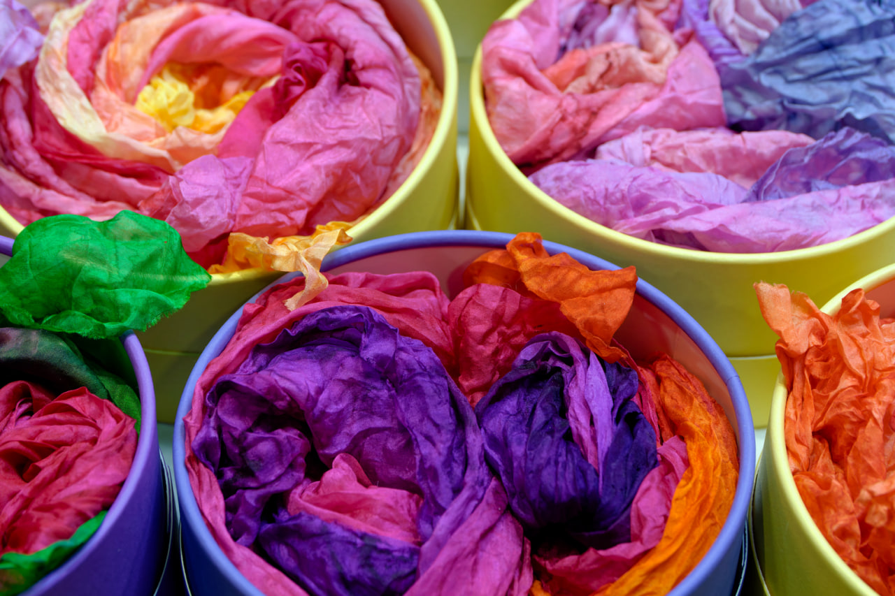
Primary Colors
Red, blue, and yellow are the three colors from which all other colors are derived. Mixing these primary colors in varying combinations will yield secondary and tertiary colors.
SECONDARY COLOR: Green, orange, and purple are the colors made by mixing 2 primary colors together. These colors are needed to create harmony.
Tertiary Colors Primary and secondary colors are blended to create more soft, muted colors for fabrics.
Warm or Cool: Warm colors (red, orange, yellow) give a sense of warmth and energy, while cool colors (blue, green, violet) give a sense of calmness and depth. Whether you use warm or cool colors will determine the overall mood of your graphic.
Color Relationships
The color relationships are used to determine pattern creation and visual balance.
Complementary Colors. Blue and orange, for example, are colors directly across from each other on the color wheel. When used together, they result in high contrast and a lot of visual excitement.
Analogous Colors: Colors that are adjacent to each other on the color wheel such as blue, blue-green and green will always create a visually appealing and harmonious color scheme.
Triadic colors are colors that are equally spaced from each other and include red, yellow, and blue. These colors provide a nice balance with an energetic contrast that would work well in a fun, energetic fabric.
Color Monochromatic Schemes Variations in value and saturation of a single color produce the same depth and elegance as the previous combination without the multiple colors.
Blending Colors on Fabric
Color mixing on fabric gives a lively, spontaneous look.
Layering – By layering one color over another you can achieve some color mixing and color transitions. Try to let one layer dry a bit before applying the next or your colors will become muddy.
Wet-on-Wet Method — Applying two colors to wet fabric allows them to blend together and create a soft-edged, watercolor-like effect.
Blended Colors
To create custom shades, blend colors on a palette and test them on a sample to make sure you have the desired color. It’s always a good idea to test the color on a sample rather than applying it directly to your painting to avoid any unexpected results.
Opacity and Transparency — Altering the density of a paint, or applying transparent pigments in layers can also be used to achieve pastel shades, glazes, or opaque results, adding an extra dimension to designs.
The strategic use of color can greatly elevate the impact of patterns. By carefully selecting and combining colors, designers can add an extra layer of visual interest to their patterns. Here are some ways color can enhance patterns: Brighten up a pattern by introducing a bold new color. Create a sense of continuity by using colors that are already present in the design. Make a pattern more subtle by incorporating its background color. Experiment with different colors to find the perfect match for your pattern. Add shading to a pattern for greater depth and dimension. Balance warm and cool tones within a pattern.
Colors also affect the way patterns appear.
Focus and Highlighting – Warm or highly saturated colors attract attention to specific points of interest and are used to highlight particular aspects of the design. High contrast is used to draw attention to important information.
Adding Depth: Darker values will appear to move backwards while lighter values will appear to move forward, creating a 3D illusion on a 2D textile. Overlapping of colors will also add to this illusion.
Limiting complexity. A palette of bold colors can be overwhelming. Mixing them with neutral colors makes the design easier to digest.
Mood and Emotion Different colors convey different emotional feelings: pastels suggest relaxation, primaries imply energy, earth tones feel natural.
Methods of Applying Color
To mix colors successfully, you have to master your tools and your technique:
Brushes You can use small brushes to pick out details or smaller, more delicate areas of color, or larger brushes and sponges to block in larger areas and to mix subtle shading.
· Sponges and Dabbers: Great for mixing colors together or for adding texture, they allow you to uniformly apply the paint, with a soft blend.
Resists and Masks. Masking areas where you don’t want color to go keeps things tidy and prevents overruns, especially with multi-colored designs.
Color layering: This is important to avoid a muddy mess. It’s also a good idea to layer translucent over opaque paint to keep the colors bright.
Practicing Your Skills
Learning to use color is a matter of trial and error.
Testing Combinations: The smaller squares provide the opportunity to test combinations of colors, see how they work on different materials, and view them in various lighting.
Recording Outcomes
A written record of the proportions of colors used, how the colors were applied in relation to each other, and the reaction of the fabric can be useful for recreating these proportions in later projects.
Creating a Color Palette
Every textile artist eventually develops a “signature” group of colors and values that they repeatedly use.